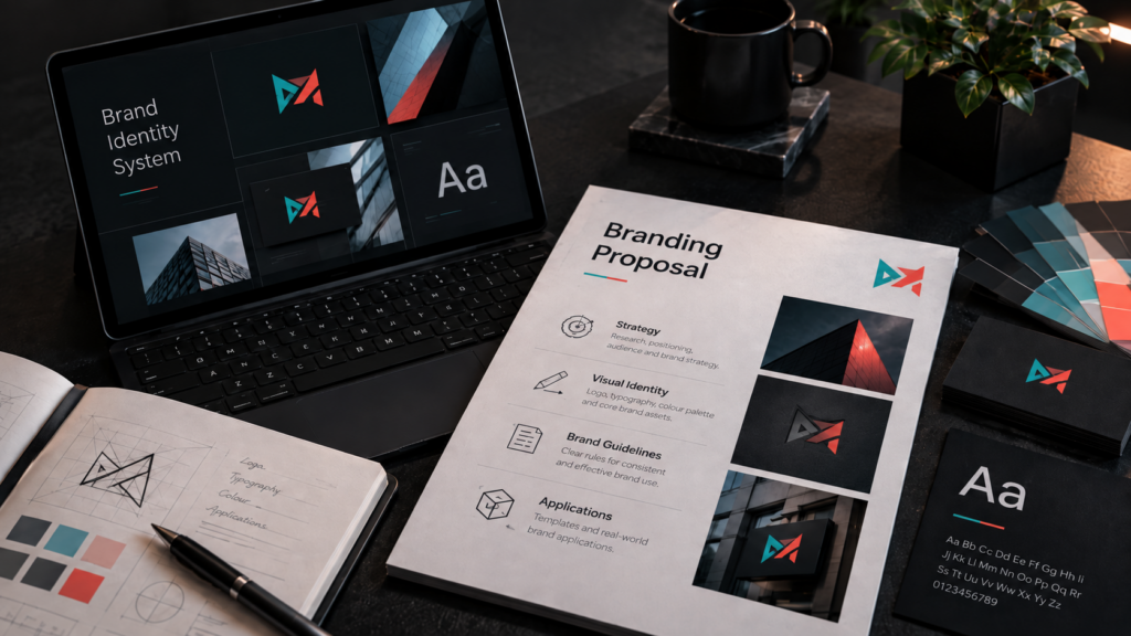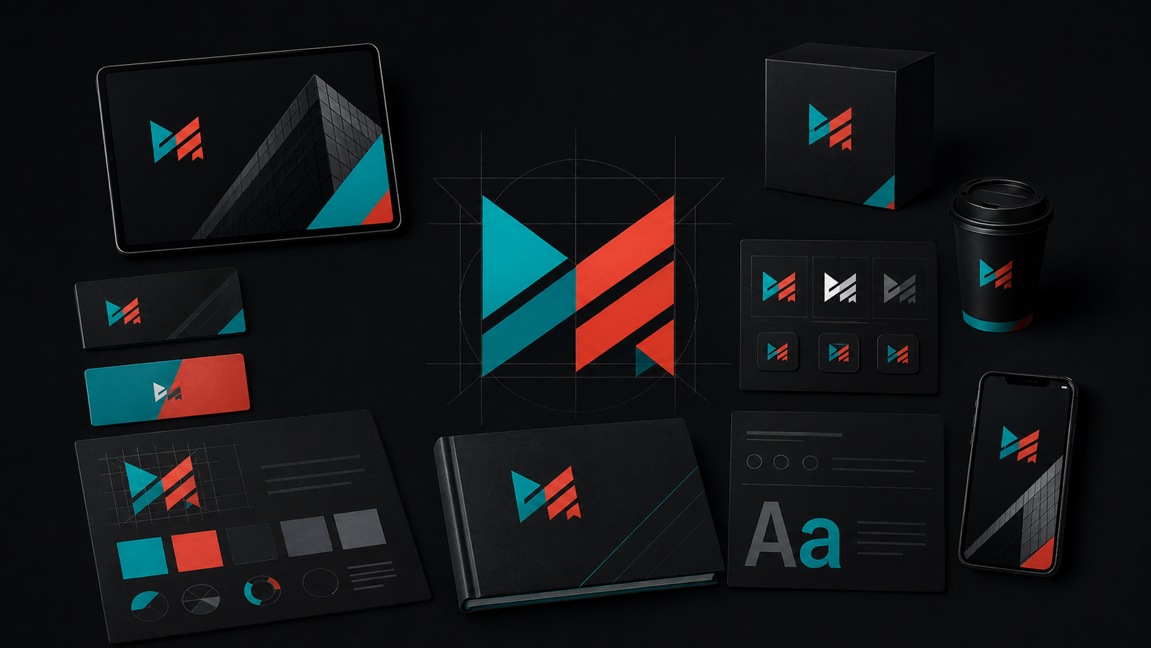
A brand identity is much more than a logo. It is the visual system that helps customers recognise your business, understand how it presents itself and experience it consistently across different touchpoints.
A strong identity should give your business enough structure to remain recognisable while still being flexible enough to work across websites, social media, print, signage, packaging and other applications.
So what should a professional brand identity actually include?
1. A Logo System, Not Just One Logo
If you’re choosing a designer or agency, read our guide to how to tell whether a logo design company is actually good.
A professional identity usually needs more than one version of the main logo.
Different environments may require horizontal, stacked, simplified or icon-only versions.
What to look for
Depending on the business and project scope, a useful logo system may include:
- primary logo;
- secondary logo or alternative layout;
- simplified brand mark;
- monochrome versions;
- versions designed for light and dark backgrounds;
- scalable vector files.
The aim is not to create unnecessary variations. It is to make sure the identity can work consistently wherever the business needs to appear.
2. A Defined Colour Palette
Colour plays an important role in recognition and consistency.
A professional brand identity should define which colours are primary, which are supporting colours and how they should be used.
What to look for
A practical colour system may include:
- primary brand colours;
- secondary or supporting colours;
- HEX values for digital use;
- RGB values;
- CMYK values for print;
- guidance for light and dark backgrounds.
The colours should work as a system rather than as a collection of unrelated choices.
3. Typography That Supports the Brand
Fonts affect how a business feels before a customer has even read the message.
Typography should support the personality of the brand while remaining practical and readable.
What to look for
A brand identity may define:
- primary typeface;
- secondary typeface;
- heading styles;
- body text styles;
- recommended font weights;
- rules for digital and printed applications.
Consistency here is particularly important when different people create marketing materials for the same business.
4. Clear Brand Guidelines
Once the visual elements have been created, there should be clear guidance on how to use them.
Brand guidelines do not always need to be a huge document. Their purpose is to protect consistency and make the identity easier to use correctly.
Useful guidelines can cover
- logo placement;
- minimum logo size;
- clear space;
- approved colour combinations;
- typography;
- incorrect logo usage;
- image style;
- examples of real-world applications.
The complexity of the guidelines should match the size and requirements of the business.
5. Real-World Applications
A brand identity should not be designed only to look impressive in a presentation.
It needs to work in the places where customers actually interact with the business.
Depending on the company, this might include:
- website and digital platforms;
- social media;
- business cards and stationery;
- advertising;
- brochures and printed materials;
- uniforms and clothing;
- signage;
- vehicles;
- packaging.
Testing the identity across realistic applications can expose problems that may not be obvious when looking at the logo on its own.
6. A Consistent Visual Direction
The strongest identities create a recognisable overall impression.
Logo, colour and typography are important, but consistency also comes from decisions about photography, graphics, layouts, icons and supporting visual elements.
This is what begins to turn an individual logo into a wider brand system.
What Makes a Brand Identity Good?
A good brand identity should be:
- recognisable;
- appropriate for the intended audience;
- consistent;
- practical to use;
- scalable across different applications;
- distinctive enough to support the positioning of the business.
It does not need to include every possible branding asset from day one.
What matters is having the right system for the business and the way it communicates with its customers.
How Magic Three Approaches Brand Identity
Magic Three approaches branding as a connected visual system rather than an isolated logo.
The scope can be built around what the business genuinely needs — from core identity elements through to applications across websites, print, signage and other customer touchpoints.
Explore our Branding services to see how we approach brand identity projects.
Link „Branding services”
A brand identity is much more than a logo. It is the visual system that helps customers recognise your business, understand how it presents itself and experience it consistently across different touchpoints.
A strong identity should give your business enough structure to remain recognisable while still being flexible enough to work across websites, social media, print, signage, packaging and other applications.
So what should a professional brand identity actually include?
1. A Logo System, Not Just One Logo
A professional identity usually needs more than one version of the main logo.
Different environments may require horizontal, stacked, simplified or icon-only versions.
What to look for
Depending on the business and project scope, a useful logo system may include:
- primary logo;
- secondary logo or alternative layout;
- simplified brand mark;
- monochrome versions;
- versions designed for light and dark backgrounds;
- scalable vector files.
The aim is not to create unnecessary variations. It is to make sure the identity can work consistently wherever the business needs to appear.
2. A Defined Colour Palette
Colour plays an important role in recognition and consistency.
A professional brand identity should define which colours are primary, which are supporting colours and how they should be used.
What to look for
A practical colour system may include:
- primary brand colours;
- secondary or supporting colours;
- HEX values for digital use;
- RGB values;
- CMYK values for print;
- guidance for light and dark backgrounds.
The colours should work as a system rather than as a collection of unrelated choices.
3. Typography That Supports the Brand
Fonts affect how a business feels before a customer has even read the message.
Typography should support the personality of the brand while remaining practical and readable.
What to look for
A brand identity may define:
- primary typeface;
- secondary typeface;
- heading styles;
- body text styles;
- recommended font weights;
- rules for digital and printed applications.
Consistency here is particularly important when different people create marketing materials for the same business.
4. Clear Brand Guidelines
Once the visual elements have been created, there should be clear guidance on how to use them.
Brand guidelines do not always need to be a huge document. Their purpose is to protect consistency and make the identity easier to use correctly.
Useful guidelines can cover
- logo placement;
- minimum logo size;
- clear space;
- approved colour combinations;
- typography;
- incorrect logo usage;
- image style;
- examples of real-world applications.
The complexity of the guidelines should match the size and requirements of the business.
5. Real-World Applications
A brand identity should not be designed only to look impressive in a presentation.
It needs to work in the places where customers actually interact with the business.
Depending on the company, this might include:
- website and digital platforms;
- social media;
- business cards and stationery;
- advertising;
- brochures and printed materials;
- uniforms and clothing;
- signage;
- vehicles;
- packaging.
Testing the identity across realistic applications can expose problems that may not be obvious when looking at the logo on its own.
6. A Consistent Visual Direction
The strongest identities create a recognisable overall impression.
Logo, colour and typography are important, but consistency also comes from decisions about photography, graphics, layouts, icons and supporting visual elements.
This is what begins to turn an individual logo into a wider brand system.
What Makes a Brand Identity Good?
A good brand identity should be:
- recognisable;
- appropriate for the intended audience;
- consistent;
- practical to use;
- scalable across different applications;
- distinctive enough to support the positioning of the business.
It does not need to include every possible branding asset from day one.
What matters is having the right system for the business and the way it communicates with its customers.
How Magic Three Approaches Brand Identity
Magic Three approaches branding as a connected visual system rather than an isolated logo.
The scope can be built around what the business genuinely needs — from core identity elements through to applications across websites, print, signage and other customer touchpoints.
Explore our Branding services to see how we approach brand identity projects.